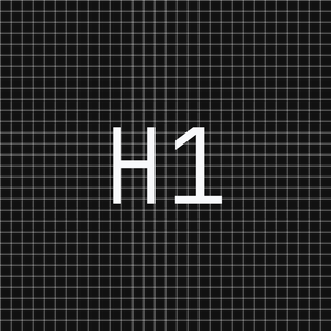
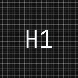
Logo & Identity
Social Media Logo PNGs
300 × 300px
320 × 320px
180 × 180px


Typeface
JetBrains Mono
Light weight (300), tracking-tight
Clear Space
2x cap height
Minimum padding around the wordmark
Minimum Size
14px / 10.5pt
Do not render the wordmark below this
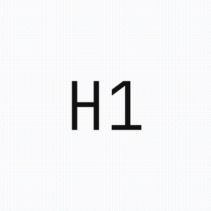
Favicon / Browser Tab
The favicon uses the "H1" monogram set in JetBrains Mono at medium weight. Rendered on a transparent background with a subtle border for light contexts. The mark should remain legible at 16x16px minimum.
Status Indicator
Color System
A neutral foundation with two strategic accents. All values use HSL via CSS custom properties for seamless light/dark theming.
Core Neutrals
Background
--background
Page canvas
Foreground
--foreground
Primary text, CTA fills
Muted
--muted-foreground
Secondary text, labels
Border
--border
Dashed separators, cards
Brand Accents
Orange
custom
Strategic highlights, accent lines
Purple
custom
Premium tier differentiation
Success
--success
Metrics, growth indicators
Destructive
--destructive
Errors, warnings
Dark Mode Equivalents
Background
--background
Dark canvas
Foreground
--foreground
Dark primary text
Muted
--muted-foreground
Dark secondary text
Border
--border
Dark separators
Footer
Footer BG
--footer-bg
Footer background
Footer Text
--footer-foreground
Footer primary text
Footer Muted
--footer-muted
Footer labels
Typography
Primary Typeface
Inter
Used for all headings and body text. Weights 300 through 900 available. H1 uses font-normal (400), H2 uses font-medium (500).
Monospace
JetBrains Mono
Labels, navigation, CTA buttons, status indicators, data points, and the logo. Conveys technical precision.
Type Scale
The H1 of Organic Growth.
Structural SEO for Search and LLMs.
We architect search visibility through systematic keyword mapping, technical optimization, and content strategy designed for both traditional search engines and large language models.
SYSTEMS ACTIVE / BOOK A CALL / Q1 2025
Structural SEO for Search and LLMs.
Spacing & Grid
Spacing Scale
Layout Patterns
Container
max-w-7xl (1400px) / px-6
Grid Background
20px grid, radial vignette, opacity-60
Sections
py-12 sm:py-16 standard / pt-24 sm:pt-28 for hero (clears fixed nav)
Border Style
Dashed borders throughout (border-dashed border-border)
Components
Buttons
All CTA buttons are dark, fully-rounded pills with monospace typography at text-xs. Primary CTAs use bg-foreground / text-background for theme-aware contrast.
rounded-full gap-2 px-10 font-mono text-xs bg-foreground text-backgroundCards
Technical SEO
Dashed border card with icon container and hover shadow.
Analytics
Icons in subtle bg containers, not bare.
GEO
Generative Engine Optimization, never "AEO".
Badges & Indicators
Navigation
Fixed top bar, 56px height, dashed bottom border, backdrop blur. Logo left, links center (mono xs), CTA appears on scroll (homepage) or immediately (inner pages). Dark mode toggle and EN/GE language switch on the right.
Iconography
Lucide icons exclusively. Never use emojis in any professional interface, proposal, or documentation. Icons render at 16px default with a subtle background container.
Do
- Use Lucide icons at 14-18px
- Place icons in rounded bg containers (bg-foreground/5)
- Map data-driven icons via IconByName helper
- Maintain consistent stroke width (default 2)
✕ Don't
- Never use emojis in proposals or UI
- Avoid filled/solid icon variants
- Don't mix icon libraries
- Don't use icons below 12px
Voice & Content
Tone
Technical
Speak with precision. Use data, systems language, and architecture metaphors.
Confident
State capabilities directly. Avoid hedging or filler qualifiers.
Minimal
Say less. Let results and structure communicate authority.
Operational
Focus on processes, frameworks, and measurable outcomes.
Content Rules
No emojis
Use Lucide icons or text indicators instead.
No em-dashes ("—")
Replace with commas, sentence splits, or spaces.
"GEO" not "AEO"
Use "Generative Engine Optimization" exclusively.
"Tapatalk" not "Tabatalk"
Correct spelling with a 'p', always.
Metrics in green
Performance results use text-success for visual consistency.
Organic numbers
Use specific figures (47.2%, $1,847) not round numbers.
Imagery
Visual Style
All visual assets follow a Swiss-design aesthetic: minimalist, high-resolution 3D renders, translucent glass panels (glassmorphism), light technical grids, and strategic orange accent lines.
Assets strictly avoid text or gibberish. Use abstract geometric icons such as tags, links, graphs, or progress bars instead of literal imagery.
OG / Social Preview
White background with subtle grid lines, centered brand text, green status dot. Image URLs must be absolute paths for reliable rendering.
https://www.h1studio.ge/og-image.png